
Beyond the Global Average
A Different Way to Think About Global Warming

Temperature is the foundation of every discussion about climate. Everything else—causes, consequences, projections, and policy—depends on understanding how Earth’s temperature has changed. Beginning with the temperature record keeps the discussion anchored in observations rather than opinions.
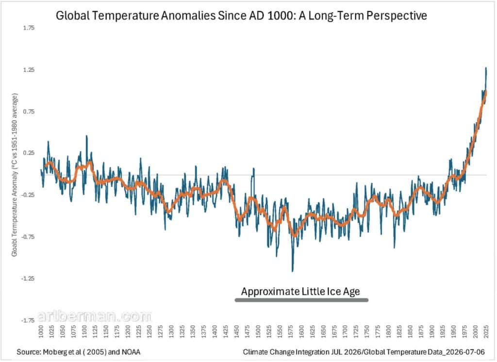
The chart below puts recent warming in the context of the past thousand years. Global temperature has been anything but constant. From about AD 1000 to the coldest part of the Little Ice Age, the long-term tendency was downward, interrupted by shorter periods of both warming and cooling. After that minimum, temperatures recovered gradually.
By the middle of the twentieth century, global temperature had returned to levels last experienced during the Medieval period. It then continued rising, eventually exceeding anything shown in this millennium-long reconstruction. The sustained acceleration after the 1970s is what most clearly distinguishes the modern period from earlier variability.
Don’t get lost in the details. Climate is extraordinarily complex, but the broad pattern is remarkably clear.
Earth’s temperature has always varied. The evidence also shows that the magnitude and rate of recent warming are unlike anything in the previous thousand years.
That simple observation provides the foundation for everything that follows.
The important question is not whether temperatures have changed, but how warming has been distributed across the planet.
Earth is now about 1.44 °C warmer than its pre-industrial baseline. That may not sound like much, but if that were your body, you would have a fever of more than 101 °F. It would not send you to the hospital, but you would not ignore it. You would take it seriously and try to understand what was causing it.
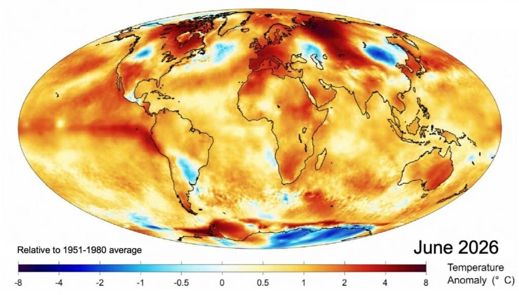
The map below shows the global temperature anomaly for June 2026 compared to the average for the same month during 1951–1980. Warmer-than-average conditions covered most of the planet. The strongest anomalies were over Western Europe, the Mediterranean, north-central Asia, and the central and eastern tropical Pacific. The coolest anomalies were largely confined to parts of China and Antarctica.
The global average is real and important. But no one lives in the global average. People live in places, not statistics. What they experience are the regional patterns shown on the map.
Large areas of the continental Northern Hemisphere were operating in a substantially warmer thermal regime than the one that shaped twentieth-century agriculture, infrastructure, ecosystems, and everyday expectations.
That is probably the most important consequence of climate change. Civilization evolved—and was built—for one climatic regime. The question is whether it can adapt to another, especially one that is changing rapidly.
This does not mean every day was 1.5 °C warmer. It means hot days now begin from a higher baseline. Heat waves can become more intense. Warmer oceans supply more energy and moisture to the strongest tropical cyclones and can amplify some El Niño-related extremes. Nighttime temperatures remain higher, reducing the overnight relief that people, livestock, and crops depend on. Warmer air also increases evaporative demand, causing soils and vegetation to dry more rapidly.
Some argue that a warmer world will benefit agriculture. Perhaps in some places and for some crops. But changes of this magnitude affect where food can be grown, how much water is needed, and how often farmers face heat and drought stress. Those are not trivial adjustments. They are changes to the operating system for our food supply.
There is another pattern hidden within the global average that I had never really appreciated until I began this recent research.